New Blog Logo!

I am very excited to debut the new banner/ blog logo today, which was designed by Patrick Mahoney, husband to the ever talented Trish Mahoney of Modern Thrifter. And not only is the new logo exactly what I had envisioned, but it didn't cost a penny to get up and running. How is this? In exchange for the design, The Mahoney family vacationed in Lexi House, one of my mother's guest cottages. In exchange for that, I twice cleaned the house for free. And to get the logo up and running on the blog, Kristen of The Frugal Girl worked out a bunch of glitchy kinks that were hovering in my blog code. In exchange for this, I sent her some Amazon gift card codes that I had earned doing Swagbucks searches. And Heather of Mile73 even took part in the shenanigans before throwing her hands up in disgust at the illogical weirdness that is the programming behind this blog. (For which she will receive beer and poutine when she next hits Portland.)
See? No money changed hands!
Despite the relative success of The Non-Consumer Advocate, it has not been a big money maker. I could definitely be savvier about monetizing the blog, but I haven't wanted to do product reviews or promote unnecessary Stuff. Luckily, Blogher pays by impression instead of per click, which works well for my readership. (You guys are really good about not clicking on advertisements!)
So enjoy the new look, and thank you to the whole team that made it happen.
Mwah!
Katy Wolk-Stanley
"Use it up, wear it out, make it do or do without"


I love that you could barter all of that! Never would have guessed so many were involved. Congrats on your new logo.
Impressive! It makes me realize that I could maybe barter for things instead of buying them too!
And I LOVE the new logo! I especially like that it looks a little "retro".
I like the new logo, but absolutely love the no money aspect!
The new logo is absolutely fantastic! Good job to your team!
I, for one, thank you for your thanks and understanding about not clicking on advertisements. I get hooked easily and try to not just wander around. One of the frugal tips is to not look at advertisements (usually in the form of magazines and TV). But I can get into lots of trouble on the Internet. So thanks for your understanding.
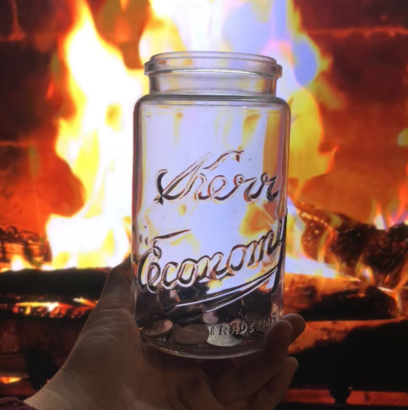
Love, love, LOVE the new logo! Canning jars and the quote are two of my most favorite things.....EVER! My grandma was always repeating "use it up, wear it out, make it do, or do it out" to all of us grand kid's. Of course, at the time there was much eye rolling, now it's my own personal creed. Funny how things change as you grow up. I am also uber impressed with your clever use of bartering (also a favorite thing). You rock!!!!!!! 😀
I love bartering, and I love the new logo.
Looks great! I love the jars.
Sorry I couldn't be more of a help. New header loots great!
The new logo looks great and it's really cool that it was the result of many exchanges of services!
Love it!!! Great header.
xo jana
I love the new logo! It is so YOU and what you/we believe in!
Okay, I absolutely LOVE your new header! It fits you and your blog perfectly!
Thanks, I'm really happy with it!
Katy
Totally love your new logo and your bartering-in-the-round!
Great new header and even better that you got it done without any money changing hands! 🙂
The new logo looks awesome! Well done!
Beautiful new look! So crisp and clean!
Purdy 🙂
The new logo looks great. Congrats!!
But what does: "Blogher pays by impression instead of per click" mean? Sorry, not blog savvy.
I am paid a teeny-tiny amount every time my blog + advertising is viewed, rather than every time a reader clicks on the actual advertisement.
Katy
As a big fan of your former logo, I was a teeny bit skeptical, but the result is great. I particularly like the way the background color and font evoke a vintage era.
LOVE the creative rounds of bartering!
Done in my favorite color of all...evokes the sea to me! Love it.
I love the new banner. And though I'd be glad for you to earn some $$ for your efforts here, I appreciate the integrity of not marketing stuff to us budding non-consumers. You rock.
It's great to see it up on the blog! Also, it was fun to read about how many more people were involved with this project. You're very clever!
I love the new logo! Many congrats! And I love how you made it happen without money changing hands. You are an inspiration Katy and your motto (so beautifully set out in your new logo) has become my new mantra. Keep up the great work! Leigh from New Zealand.
The logo is adorable! Good job!