Please Help Me with my New Blog Logo!
I worked the last two days and came home to a bazillion and three e-mails to slog through, as well as a delicious decision.
The e-mails were mostly comments from my piece on couponing, although there were also multiple e-mails about soccer, kid school stuff and random notifications of this and that. And for those of you who think I may be exaggerating, I currently have 659 unread e-mails in my inbox. (I check e-mail on two different computers, so it's hard to keep up with.) Oy vey.
However, I did have an e-mail from Modern Thrifter's Trish from design group The Mahoney, who is the graphic designer designing my new blog logo. She sent over a few preliminary sketches for me to start thinking about, which was the perfect e-mail to get after a long, long day at work. (We were busy, so I worked a 12 hour shift) Keep in mind these are just rough drafts, but I'd love your input.
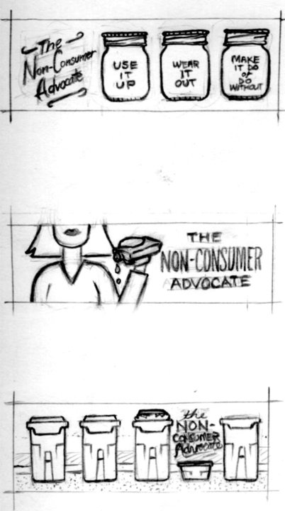 I am leaning towards the 1st and 3rd choices, although worry that I can't pull off the darling Mason jars, as I haven't done any canning for at least four years. (Although I'd be happy to steam up the kitchen in the name of earning the right to live up to the first one!)
If you have an opinion, I would love to hear it, even it's a brand new idea!
Thank you to the divine Trish Mahoney, whose blog and husband and wife design website are both eye candy for the design impaired such as myself. Check them out to get an idea of what I'm going for!
Katy Wolk-Stanley
"Use it up, wear it out, make it do or do without"

My immediate response was the first one. Number three could work, too. Number two looks like someone emptying a flask to me. Have fun choosing.
ps I didn't even think of canning when I looked at the first one. I thought of storage and other uses for the jars. Of course, the make it do saying always rings true for me.
I guess I should add that I am trying to have the logo be a little less "housewifey" and more gender neutral in its appeal.
Katy
Kathy summed up my thoughts exactly. I really like #1 but #3 is pretty great too.
Katy, I don't mean to be a killjoy, but I really love your current logo, the illustration is so great and so much more original than most blogs. Please reconsider, because I'm finding this trend of blogs being more professional/slick uninspiring. I'm not trying to insult the new drawings, just saying I really prefer what you already have.
Good to know, but it's been three years, and I'm ready for a change. Also, I feel like the blog has been kind of stagnant and needs a boost.
Katy
how about a clothes line along the same lines as the mason jars with 3 tee-shirts with the same words?
I second this idea. It could still be construed as "housewifey", but you do love your laundry line!
Although, since Portland has had like 2-1/2 sunny days in the last 6 months, it's been a mostly unrequited love.
Katy
The first one is the only one that makes any sense to me. Maybe I'm dense. After someone commented about emptying the flask I figured out #2. I'm still in the dark about #3. What are those things?
Rolling trash cans vs. a recycling bin. Although in other areas of country/world they may not be immediately recognizable. Thanks for pointing that out.
Katy
I thought it was a smaller trash can which I think is the best design and very poignant. I'd go with 3. I like that #1 incorporates your motto but that could just be written beneath.
I like the idea of a new logo for your blog - the logo you have is OK but never really expressed "you" (in my opinion!). I love the mason jars, but how about 4 jars, so the last one says "do without" (the text is crowded and visual/reading rhythm seems off to crowd that last part onto the 3rd jar). I don't associate jars with only canning - storage and thriftiness too. I like the other comment about t-shirts on a line - a good idea too!!!
Agree! (With everything)
These are my sentiments exactly!
Agree with that one. The third jar is way too crowded...
Or...how about 3 jars: Use it up - Wear it out - Make it do and then "or Do Without" in blank space next to the third jar...the without a jar space.
Have fun!!!
No. 1 is my pick. And I like Ann's idea very much - the visual representation of doing without is great.
#1 is my gave by far. The clothesline idea is cute too!
I'm with you on #1 and #3, I like those two better. And I like Juliet's suggestion above, about the clothesline. You did say you want to be less "housewify" and for some reason, hanging clothes to dry unfortunately seems to be in that domain.
I like #1 better than #3. The first thought with #3 was "trash." Even though the barrels are empty, it took a few seconds to process the statement of empty trash barrels. I like that statement, but not the barrels. Perhaps an empty shopping cart is a closer sentiment?
I like the jars. I also did not think of canning or jam. I thought "cute storage." So to move away from "housewify," perhaps the jars can be full of household tools. Kitchen utensils in one, maybe pliers and a screwdriver in another, and the last, a jar full of coins. Perhaps too much detail. I dunno.
This is exciting! Congrats on revamp!
I love the first one, it is really cute! I love mason jars, they are so useful for all sorts of thing!
I like the first one best of these three, but I think it might be better with four jars so each bit of the saying has it's own jar. What about a clothes line with the blog name and each of the four parts of your motto on a different piece of clothing/towel/sheet, etc.? That would be very you!
Another vote for the Ball jars or the clothesline idea suggested by Juliet. I recognize the rolling trash cans, but my first reaction is that non-consumers don't have 4 trashcans! (And I thought #2 was a peanut butter sandwich dripping jelly. Is this some kind of secret Rorschach test?)
I thought #2 was a sandwich, too...
I usually only have one brilliant idea per day. So, I'm using it for you -
how about several empty shopping bags? (like the fancy department store kind?) You could put the motto on 4 of the bags. Have at least one of the bag lying down, so you can see it's empty. To me, that symbolizes not shopping for things you don't need, not paying retail (i.e. inflated prices or fancy store prices) for things you do, and getting by with what you already have.
🙂 I love the empty shopping cart idea, but it feels to narrow (groceries only) to me.
I'm finding a trend but my first reaction was LOVE the jars. I'm not a canner so I was thinking of leftover containers....I also think the clothesline idea is cute b/c it would tie in your "old" logo with your new one. Good luck....can't wait to see the new "you."
Definitely the mason jars!
I vote for the first! It's pleasingly visually symmetrical, I love the fact that your "slogan" is incorporated, and mason jars evoke all kinds of wonderful associations--jam, caned goods, drinking glasses....
The second, to me, doesn't quite embody the spirit of your blog--I look at it and think "Huh?" .
The third is OK too, but I have an "ick" reaction to the recycling/garbage containers (from doing all our family's recyling, I guess) versus the warm, cozy Mason jar reaction.
That said, I hope you pick the one that YOU like best!
#1
I love the first one. Even if you don't can, Mason jars can be re-used, or up-cycled, in a million different ways. Our grandparents would never have dreamed of throwing out a good glass jar. Too many uses.
Plus, those canning jars are prabably pretty easy to find at Goodwill (another tie in to your blog).
My first thoughts:
#1--why not four jars?
$2--what is that? why?
#3--Katy should not have three trash cans and only one recycling bin!
Would it crowd the jar images too much to have a line drawing of a hammer, a needle and thread, and a cooking pot? Masculine, feminine, gender neutral? Of course, males or females can use all.
Your logo can use more of the length of the page without overpowering your blog. Some blog logos/banners are in the way of the blog post even being seen. I really don't mind that.
The idea is that others are filling their garbage cans, while I just have the small recycling container.
Kayu
Umm . . . "Katy." 😉
I like the first one.
I love the clothesline idea. How about Katy as Coin Girl in a mask & cape, hanging up the 4 t shirts ?!
I really enjoy your sense of humor, Katy, and just thought it'd be nice to express that somehow with your new design.
I really like #1! The jars didn't make me think about canning, but more about reusing things and making do with what you have on hand, since there are so many things that you can do with reused jars!
Definitely #1 but i like the front for the name on #2. Also, maybe fill the jars with quarters, dimes, and pennies since you are coin girl. Or add a fourth jar for nickels.
I like the first one, but do agree that a fourth jar would help with the text. It is more of a visual issue. Not sure on the housewifey issue. A clothesline would be good, but would not work with your more inclusive direction.
Mason jars, for sure.
Mason Jars. No question.
I like the Mason jars, also. Maybe you could do them in the old blue color they used to come in. That would tie in your thrift store visits. (I mean I always snap up blue Mason jars if I find them at the thrift store.)
I think I like one the best - but like others have said expanded to 4 so the third jar isn't so crowded with text. I like how the name of the blog is on the side with the lettering similar to Ball jars, ohh maybe put your blog name on a reusable cloth bag?
I like number one, but what about putting "or do without" below the mason jars? (I like the idea of having the "do without" portion not enclosed in a jar to subtly illustrate that point)
Good idea
Hi Katy,
This is actually the correct link for the Mahoney Design Team: http://www.work.themahoney.com/ The one you have posted will take care of all your insurance needs, though ;).
Holy crap, thanks for pointing that out! I've fixed the link.
Katy
I like the mason jars best. Trash cans seem weird as a logo and I didn't get what you meant until I read the comments. The shopping bag idea is cute too.
While I was reading I was hoping you'd ask our opinion, so I could say, Mason jars for sure.
#3 then #1. I'm not so hot on #2.
Chiming in to agree with the masses. Where I live, the recycling bins are exactly the same size/shape as the trash ones, just a different color. So I couldn't figure out what was happening in no. 3. The Mason jars are fantastic! I also love the clothes line idea.
My vote is for number one as well. The third is actually my least favorite. I also like the earlier suggestion of the clothesline almost as much as the mason jars.
Mason jars, yes, from a different Jenny. Clothesline could be cute, too.
Definitely the first one
I like the first one the best, and I agree with the comments that it doesn't necessarily have to denote canning, but reusing what you already have. 🙂
#1 is my favorite, because I love the motto.
This has been a fun project—thanks for the feedback. These are all just very rough designs, mostly meant to convey the general concept and not a final layout, so keep that in mind. It's easy to get caught up in the details about the number of jars or placement of text, but at this stage, that's not all that important. What's really helpful is to get feedback on how the concepts resonate... which ones seem to embody the blog as a whole, what kinds of emotions they evoke, etc.
I had equally liked #1 and #3, and it was interesting to get the feedback from readers that they didn't understand what they were. I guess in the Pacific Northwest we take these for granted, but that isn't the case elsewhere, (and I do have a lot of foreign readers.)
Like the post when I asked for feedback on how to do my dining room curtains, your reader feedback really did change my mind.
Thanks everyone!
Katy
Yea, I REALLY like the first one and as has been mentioned already, the canning jars could be about storage.
Love the jars, and I did not think canning, I thought spaghetti sauce jars repurposed for storage!!
IMHO: The typography from the second one with the image from the first. They're all quite cute...and I'm sure it'll look awesome, whatever you choose!
My first instinct was to go with #1, but I agree that it is more feminine and not quite what the blog is about. So, after some thought I choose #3 🙂
I vote for number one. I didn't even understand the other two. The second one looks like you are advocating alcohol and the third one looks like salt shakers? They don't make sense to me.
Kate, I love old mason jars, also applesaucing, though last year the local apples weren't on the trees thanks to pruning the season before. BUT I also use our many many mason jars for visible storage of grains and seeds and beans. Also pocket watches. So my vote is for #1.
1st one.
I like the Mason jars best, by far.
I may be late to the game, but my vote is for #1 also. When I first looked at #3, I thought it was a litterbox with your name written in the funky fumes. Also, where we are, the recycle bins are big and shaped just like the trash cans...they're just green instead of grey/black, so the idea totally didn't connect to me.
I don't know if anyone else got the "cat poop" vibe...it could be just me.
OK, this is driving me nuts--can someone explain #2??
If it's saying that Katy uses everything until the last drop, wouldn't she be USING that last drop instead of letting it drip out??
The first one!
I love the first one!!
The first one!
especially if the tagline looks like it is embossed glass on each of the mason jars.
and you use mason jars for yeast...see pizza post! not just for canning.